Sub-Project of the Midjourney Hospital Room Image Validation Study
1 An explanation of projective or depth testing
The practical realities of spatial perception and the reception of architecture have long resisted easy classification, and, if we wish to design inclusive spaces, “getting it right” will be no easy matter of specifying the right decibels, frequency, texture, lumens, or hue. People are wonderfully diverse, as are their aesthetic preferences. Moods, previous experiences, contexts, and idiosyncratic sensory processing all impact how an environment is received by occupants. While psychologists have developed a laboratory model for measuring stimuli as discrete inputs, most people process aesthetic experiences as complex mixtures of expectation, meaning, and stimulus.
Clinically, a person who processes visual, aural, olfactory, touch, and/or vestibular senses as multi-modal or cross-sensory experiences is typically categorized as disordered. In other words, this diagnosis considers a person who smells colors or sees sounds to be non-normative and asserts that they may face challenges while operating in a neurotypical world. The field of sensory design, on the other hand, has embraced such cross-sensory experiences and asked how the challenges associated with such non-normative sensation might be reduced. Designers have also wondered how to craft a richer, more healing range of environments than those designed around vision alone.[1] I suspect that many people’s perceptions of their environments are based on previous sensory experiences that are not as neatly segmented by sensory type as a laboratory scientist might wish.[2] Reception of an environment is overdetermined, and it results from a mix of sensations and meaning.
Especially in the case of a hospital room, the weight of past experiences and the emotional intensity of hospitalization itself greatly influence reception of the environment. This intensity applies as much to the vulnerable patients (quite possibly in pain, exhausted, and afraid) seeking healing as it applies to the caregivers for whom the room should be efficient, accessible, and easy to keep sterile.[3] For over a hundred years, architects, doctors, hospital administrators, and others have studied the design of spaces for healing, and yet it remains a challenge to create a room that can be all the things it is asked to be: quiet, affordable, easy to clean, comfortable, efficient, and welcoming. But over the last hundred years, a type has clearly emerged in most hospitals in the North American, European, or Western-influenced countries globally. While impressively standardized, the type is unsatisfying for many patients (who find it boring, cold, loud, etc.) and for many staff (who find it draining and constraining).
One word that is regularly used by patients to describe what they want in a hospital room is “quiet.” Much solace comes from closing the door, softening materials where possible, turning off or down the alarms on the various devices that are monitoring and healing the patient. What other improvements could be made in the appearance of the room to create a sense of quiet? Could dimming overhead and mechanical lights reduce overstimulation? Perhaps the patient could choose a color or texture to reduce their sensory overwhelm. There are a lot of challenges in making a hospital room actually quiet, and certainly decibels are not the only thing that matters. Giving patients control over the environment helps, as can earplugs or an explanation of the sounds. Could an eventual virtual reality headset or video screen be able to reimagine the standardized hospital patient room even further? With such latitude for design, what would a “quiet” healing space look like and to whom?
2 AI as Inkblot
Psychologists have long used various techniques to elicit responses to visual phenomena, embracing the idea that these responses are fundamentally emotional. Such tests were most commonly used to learn about the patient, drawing out their fitness for military service or other work as well as any diagnosable pathology, but we speculate they could also be used to learn about the environment. One technique in particular tries to work from a stimulus that is not preloaded with the expectations of the examiner. Swiss psychiatrist Hermann Rorschach (1884–1922) was the first to use imaginative ink blots for insight into the psyche. Later, Alfred Binet developed the inkblots into a test that has been used widely in the United Kingdom, India, Turkey, United States, and other places.[4] In the 1940s it was believed “subjects react to the color in the blots in a manner similar to their emotional response to their environment.”[5] A subject might also be scored on their approach to the image: Do they view it as a figure or as a background?[6] Do they mention and respond to parts of the image or make a conclusion about the whole? The traditional thinking went that a well-controlled person would give a discrete response, such as saying that the bottom of the blot looked like a red fish. A more explosive, emotional person would see similarly volatile, ephemeral environments and speak of smoke or fire. Clearly the scoring of the test was subjective, and while a patient who declares that the blot looks like a fish is listed as ideal, it was also believed that a focus on discrete objects can be a sign of brain injury. The inkblot test is as messy and complicated as the humans it seeks to measure. In the classic form, subjects may be evaluated on the length of time it takes them to respond or by other overt behavior (such as blushing).[7] While the specific method of evaluation did not apply in our study, we were inspired by the way that scenes can be shown and responses gathered. Given what we are learning about affective perception and trauma-informed design, gathering such immediate emotional responses is valuable. For hospital rooms, the emotional response is quite important and likely has its own logic. The openness of the inkblot method may be useful for gathering responses that would not fit on a checklist or Likert scale of existing conditions. It is that very openness of the inkblot’s inquiry method that appeals to us in this exploration (Illustration 1).
3 Methods
To craft a similar projective instrument to the inkblot, we prompted the generative visualization tool Midjourney version 5.1 to generate images that could serve as inkblots we could use to solicit participant reflections about the images and their underlying design. Midjourney is a tool that makes novel images by combining elements of existing images in a large dataset. These images are tagged with words that describe elements of the images and users can then use those words to ask for new images. Midjourney and other tools like it, such as Dall-E, have proliferated quickly since their introduction circa 2023. Their actual workings and specific datasets remain proprietary and closed, and many speculations and critiques abound.[8] For this study, we asked the tool to produce images with prompts that are frequently stated to be desirable in hospital rooms. In this paper, we discuss the images created with the word “quiet,” but we have also measured responses to the prompts: clean, warm, well-lit, and institutional. We chose these words after studying hospital history and consulting the evidence gathered in design guides produced by the Center for Health Design.[9] We then asked the generative visualization program to draw on its vast, if unknown, database of images assumed to be quiet (clean, etc.). We wondered if this approach might exceed our own biases and expectations by making use of the large-scale pattern knowledge in the Midjourney tool. We also thought that doing this exercise was akin to validating Midjourney; can we confirm that it is working properly? Certainly, compared to the Center for Health Design guides, our findings are much less of an immediate set of instructions for how to design. Instead, we hope to have opened the possibilities for design to create quiet in other ways as designers learn how complex a phenomenon the perception of quiet truly is. And in the process, we heard a lot about what patients think about when they look at hospital rooms.
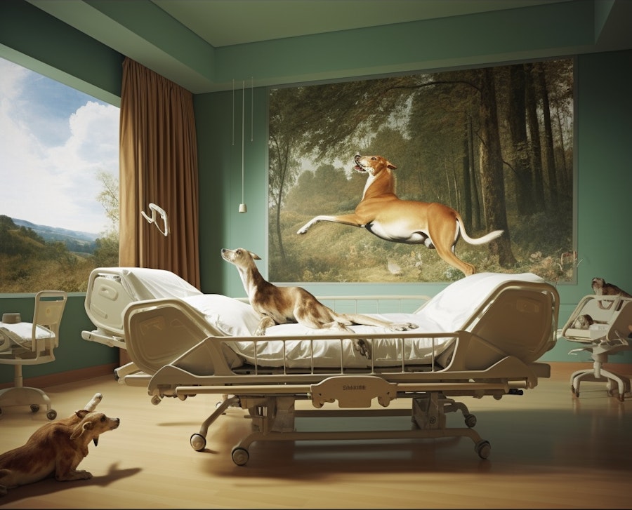
Before the study images were generated, we explored possible hybrids made from standard hospital rooms plus a few additional prompts. Examples included a series of flowers, murals, and other elements of nature. We embraced the open and imaginative method for a time, producing uncanny images such as this one of a dog jumping on the hospital bed in front of a painting of a dog.
Generative AI is deeply biased and, indeed, its methods are quite opaque. As Joy Buolamwini writes, “current methods do not allow us to explain in full detail how a neural network recognizes a pattern like a face or outputs a response to a prompt.”[10] And yet many of these implicit biases against underrepresented minorities are clear. Some of the most well-documented biases include gender stereotypes, for example, the generative AIs tend to produce images that appear to be men when prompted to depict “a professor” and more female people when asked for an image of “a teacher.” Similarly, words like “intelligent” are more likely to output male images and “beautiful” tends to offer images of young white women.[11] These biases are easy to recognize, but what about biases in environmental preferences or about the way environments are expected to look? A quick prompt for various types of hospitals (cardiovascular center, cancer center, or women and children’s hospital) reveals some basic stereotypes, and asking for a psychiatric hospital shows intensely the stereotypes and expectations in the dataset. The process by which the generative tools make these connections and the data on which they draw are deliberately obscured by the companies that made them, but we set out to validate the outputs with participants of various demographics to see whether the results fit. It is quite reasonable to assume that the dataset cannot be used as is, it has too many biases about what healing spaces are and what lighting is desirable. Or does it? How can we know? The aim of the study was to begin to validate the outputs and see what needs to be altered so that later we might begin to treat generative AI as a design tool but maybe with a different dataset. How well did Midjourney do when asked to make hospital rooms that look quiet? In other words, we ask: can we validate the outputs? And, in so doing, what will we learn about such complicated notions as what a quiet hospital room is expected to look like? To whom?
Asking an image generating tool to make hospital rooms that look quiet is necessarily somewhat paradoxical, though it probably does not bother the tool at all. Quiet is typically not something a human can see, though oftentimes a color can be spoken of as a “loud”. However, Midjourney is by design, highly capable of reproducing abstractly stereotypical images, so what visual characteristics, according to Midourney, are often associated with the word quiet? A useful design tool would need to grasp all the irrational and synesthetic aspects of environmental perception, many of which are also cultural and experiential. And in some ways, an irrational tool like Midjourney may be suited to collating many associations with quiet into one stereotypical image.
After receiving IRB approval, we consented and enrolled 231 participants between the ages of 20 and 86, through the University of Michigan’s Health Research Database (https://umhealth research.org/) of which 227 participants completed the survey. Of the 92% of participants reporting prior hospitalization, 38.0% were hospitalized during or after February 2020. Enrolled participants were shown AI-generated images of hospital rooms and asked to rate the images according to whether they agreed that they were clean, quiet, well-lit, and institutional. We also asked participants for written responses to the way the room might make them feel. Following these ratings, participants were asked to rank their favorite and least favorite images. Participants were asked two questions at the end of the study: (1) if any aspects of their identity or previous hospitalizations influenced their responses, and (2) if knowing that the images were created using generative AI changed their perception of the images or the study. These results will be discussed in other papers.
The overall study used a random ordering of twelve total images presented in six pairs with one pair of images generated for each of five prompts (clean, warm, quiet, well-lit, and institutional) along with a pair of base or control images of “standard” hospital patient rooms generated without additional information added to the prompt. Once the control images were made using a synthesis of existing images and Midjourney’s processing, the test images were then blended from those, resulting in more of a familial relationship of forms than a seemingly unrelated series.[12] We used pairs of images rather than one image to get clearer data about whether the participants were responding to the prompt or another feature of the complex images that Midjourney produced. As with much of design scholarship, it is hardly an exact science but we hoped to narrow down responses in this way.
The participants were asked four questions, evaluating statements about the hospital room images by selecting between options of strongly agree, somewhat agree, neither agree nor disagree, somewhat disagree, strongly disagree with four statements:
#1 the hospital room is clean.
#2 the hospital room is quiet.
#3 the hospital room is well-lit.
#4 the hospital room is institutional.
To capture their overall impressions, we asked for a ranking of one image from each pair, helping us evaluate preferences for particular images and room features.
4 Initial Results
Midjourney produced vivid images, clearly replicating what a stereotypical hospital room looks like (Illustration 2 and 3). Adding the prompts sometimes produced expected variations, such as when the clean prompt made a particularly white and unadorned pair of images, and the warm prompt produced more oranges and yellows as well as some patterns. However, some results were unexpected, such as when the prompt for well-lit produced an image with dramatic theatrical lighting far darker than a surgeon might wish for. The quiet images were also darker than the control images, perhaps some association with lower light and less sound, though they are not nighttime scenes. The quiet images feature light blue green, a view of a foggy city with conifers in the foreground in one case (Illustration 4). The other image of quiet that we used also had conifers, some fog, and a mountain with a waterfall running down to a clear lake. (Illustration 5). Would the implication of the waterfall be a shushing sound? We tried not to curate the images suggested by Midjourney, but we were delighted to include this image because it has an unusual feature: a floor that also looks like the surface of a lake. Does the dappled, reflective surface correlate so strongly with quiet that the pattern suggests that it belongs in a room that is quiet? And did participants find that unusual or unpleasant, or is the tool right that humans find this water floor to look quiet?

Image 1
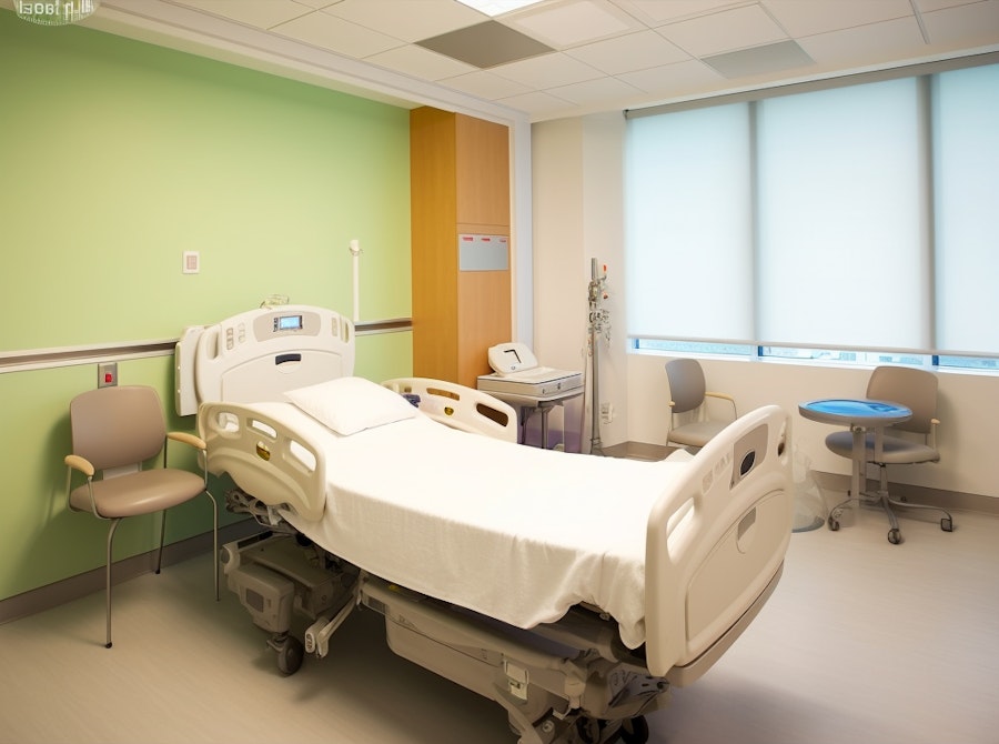
Image 2
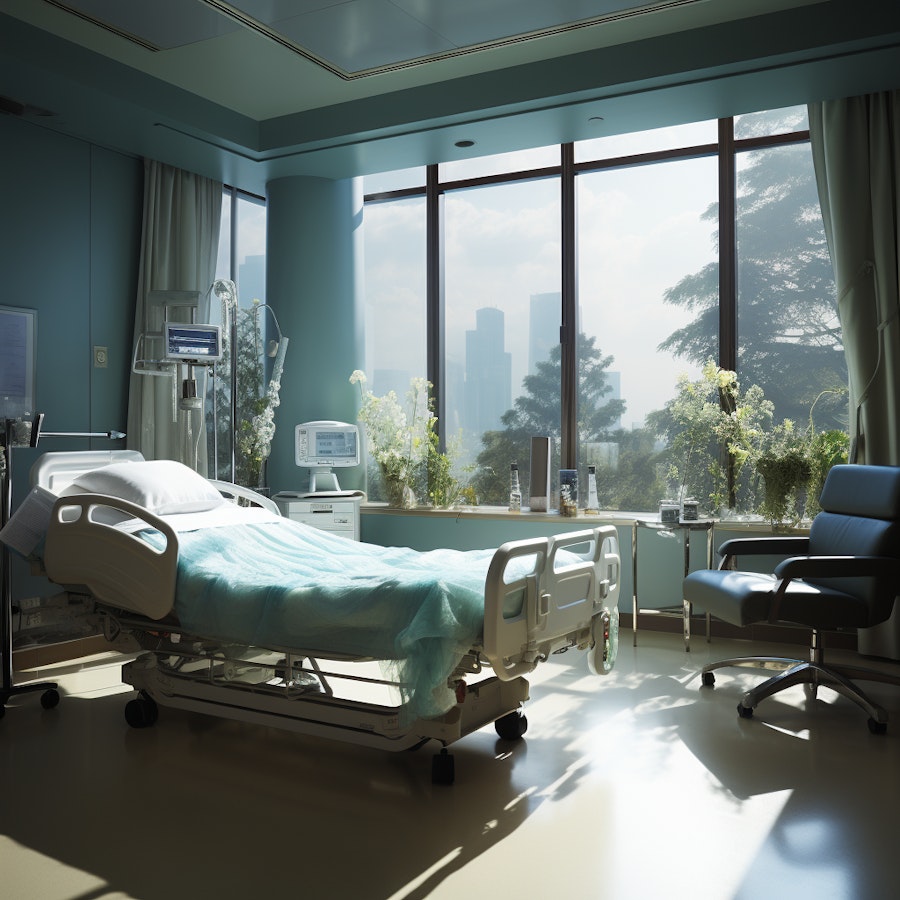
Image 7
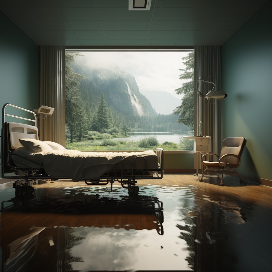
Image 8
More thorough data analysis is forthcoming, but an overall assessment of the rankings can give a sense of the preferences. 221 participants ranked the images, 7 chose not to or were unable to. Image 1 (control) had the largest percentage of last place rankings, 74 (32.5%), along with the highest number of second to last place rankings (n=56, 24.6%). Image 3 (clean) had the largest (n=85, 37%) percentage of first place rankings. Image 7 (quiet) had the highest number of second-place votes, and the highest combined score with 129 (58%) participants ranking it either first or second. Image 3 (clean) was close with a combined first and second place ranking of 109.
When asked what they disliked about Image 1, responses often used the words drab, sterile, typical, functional, or institutional.[13] A participant who ranked Image 1 in second place remarked: "The lighting is too bright. Seeing the hospital machines and monitor on the wall is unsettling. The flooring and curtains are boring. The metal strips on the wall are grotesque. The view of the building outside is ugly and disturbing. The bed is institutional- it looks cumbersome and the sheets are stark and unsoothing." The same participant remarked that there were upsides to this "Low frills/cost and has the equipment needed to care for a patient. The maintenance of this room, I believe, would be much less than the other rooms being evaluated." Another who liked Image 1 remarked that it was "Like any other hospital room." And when asked what they disliked, they said "Not much." But many of those who ranked image 1 in 6th place objected to the same things, calling it "Dreary, cold, uninviting" and agreeing that the lighting is too bright. These comments about the lighting seem to be one of the most consistent patterns though more data analysis is necessary to make that determination.
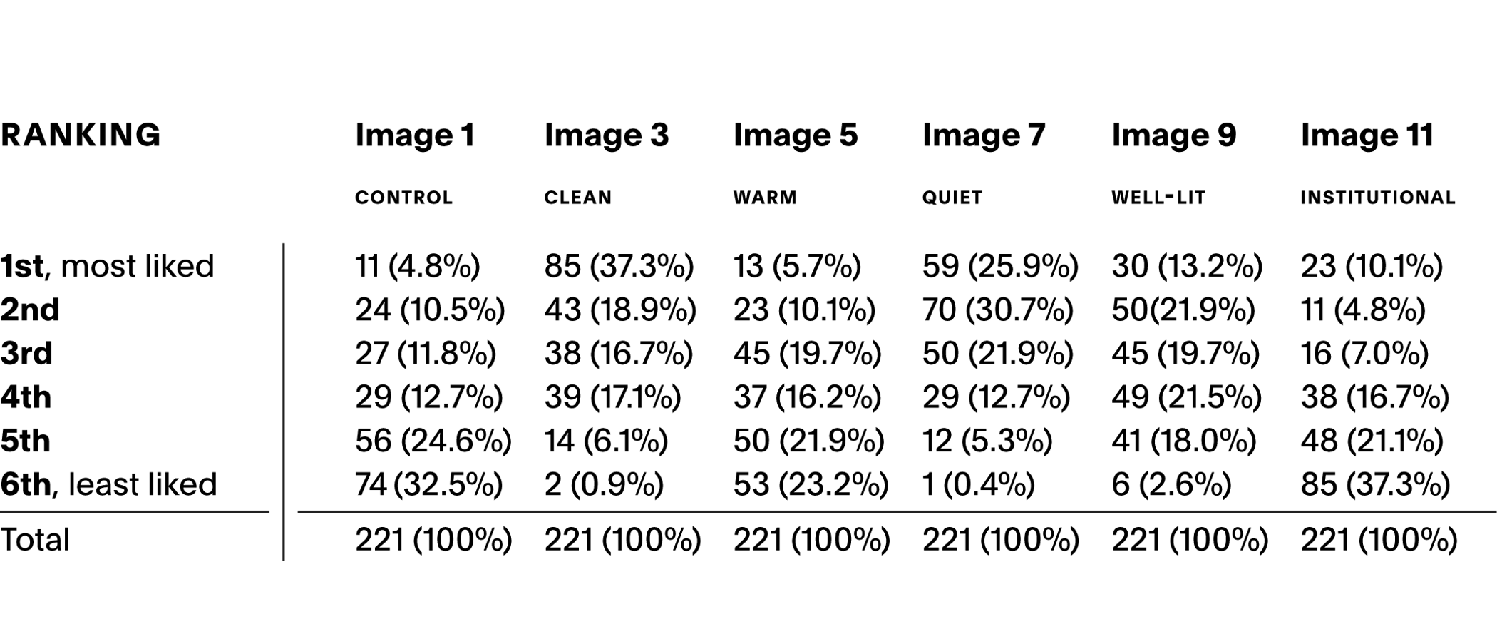
[Table 1] Rankings for each image
Taking a closer look at the quiet images in comparison to the control images we find some support that the tool worked, in other words, Midjourney did make images that are ranked as looking quieter than the control images. The majority of participants strongly agreed or somewhat agreed that the quiet-prompted images were quiet with 86 (37.7%); 80 (35.1%), respectively, for Image 7 and 81 (35.5%); 71 (31.1%) for Image 8, as shown in Table 2. Only 1 participant for image 7 and only 5 for Image 8 disagreed with the statement that the images were quiet. We can compare these results to the number who thought the control images were quiet, as shown in Table 3. Only 6 participants strongly agreed that Image 1 was quiet and the same number found Image 2 to be quiet. The highest number seem to have felt neutral about whether the control images were quiet, with 28% indicating “Neutral” for Image 1 and 26% for Image 2, which is slightly fewer than found the quiet-prompted images to be quiet. And it is worth noting the stronger reactions to the quiet images, with fewer participants indicating “Neutral.”
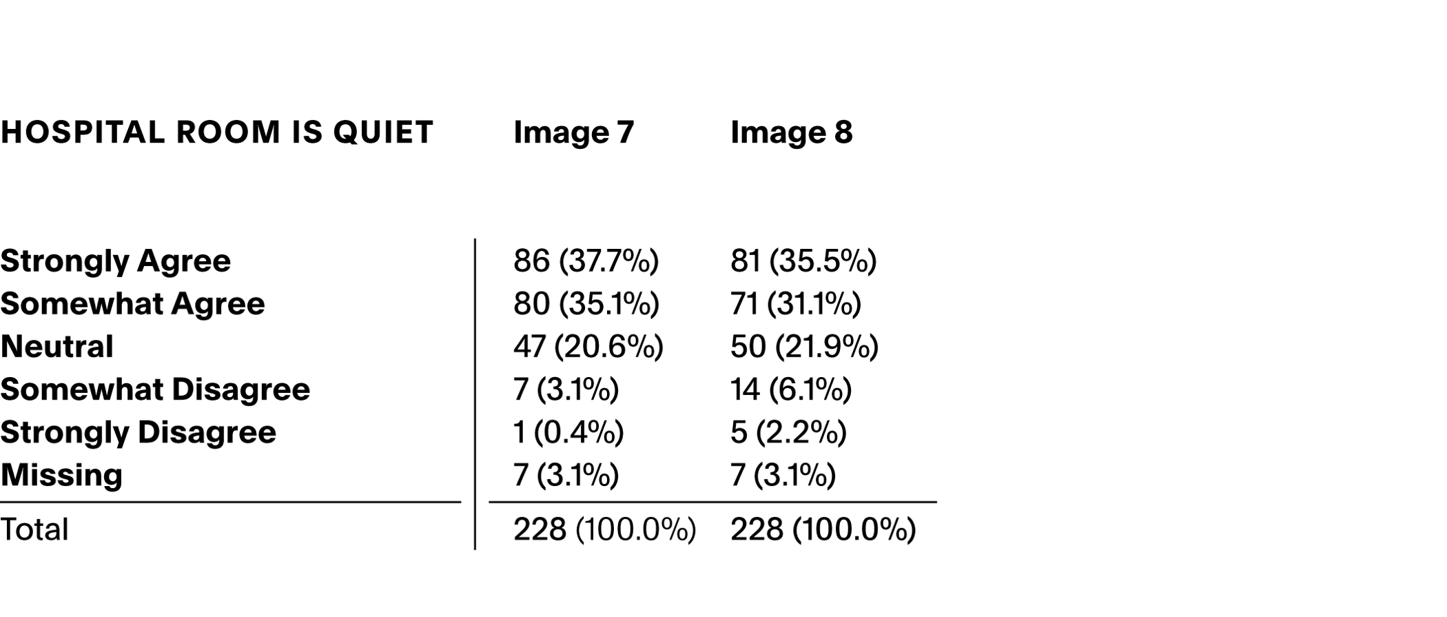
[Table 2] Percentage of participants who responded to the statement “Hospital Room is Quiet” when looking at Images 7 and 8 made with the prompt “quiet.”
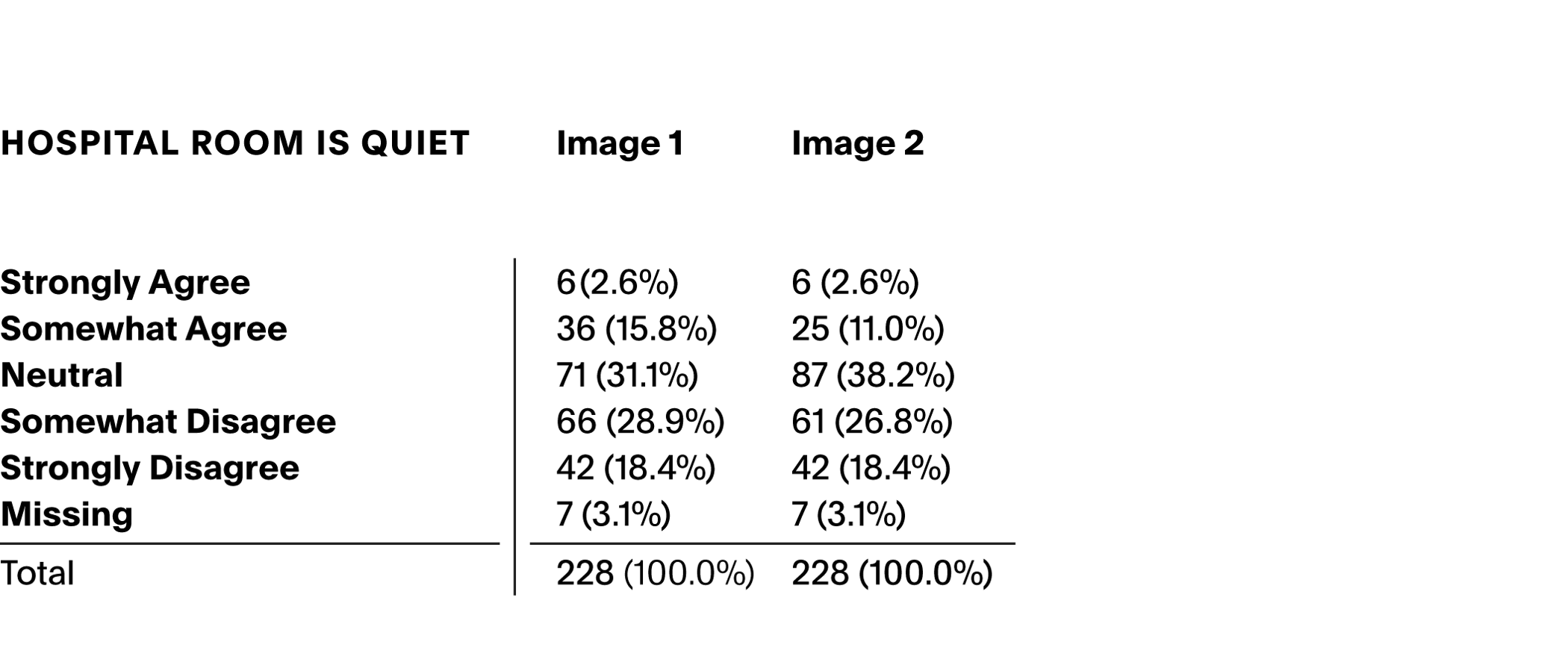
[Table 3] Percentage of participants who responded to the statement “Hospital Room is Quiet” when looking at Images 1 and 2, the control images.
Participants were asked, “In your own words, how would you describe the way this hospital room looks?” Single word comments ranged from magical to sad; one participant simply commented “bad” while another wrote “I think this room gives you inspiration to feel better.” Many participants remarked on the view out the window, noting that it made the room seem “serene” and “less institutional.” At the same time, one participant noted that “The trees in the foreground are nice but the cityscape in back is not conducive to healing.” We gathered many such observations where participants indicated their expectations about what a healing environment would be, and we believe that the questions of city versus nature, and what kind of nature are conducive to healing, are in need of further study. Many participants called Image 7 “comfortable.” Some called it “dark” or “oppressive” while others called it “airy.” There were practical interpretations: “The hospital bed still has the same uncomfortable mattress, it needs a thicker mattress or extra padding where the bars on the frame are.” There were comments that interpreted the fog outside the window as “smog.” A few participants described the rooms as “intended for VIPs” or even as an “Executive hospital room for the rich and privileged.” Some interpreted the rooms as though they themselves were occupying them; a few participants commented that there was “plenty of room” to move around but one noted that it was “too crowded.” One participant reported it is “A little too busy" and “most probably noisy” while also saying they neither agree nor disagree that it was quiet. Another similar comment describes the room as “Comfortable. Possibly noisy (both from the monitoring equipment that's finally visible and from outside since the cityscape implies traffic noise).” And this participant also indicated that they neither agree nor disagree that it was quiet. Such inconsistencies are human. Duration spent with each image could be analyzed to gain insights into how perception of noise may increase with time viewing the image.
Most participants reacted directly to what they saw, but some clearly told stories about the space, and really considered the life within, bringing their experience as patients to their interpretation of the story told by the scene: “Dimly lit hospital room with a non-matching chair borrowed from the nurses’ station.” One can imagine easily that such a thing happens when chairs are too few, and we note the ability of these uncanny images to solicit such narrative responses.
Participants were asked “What features of this hospital room do you like?” and most participants mentioned the view and the large window: “I like the fact the outdoors looks out on mature trees - a view is important to me when I am in the hospital.” Many mentioned the comfortable chair and the window ledge where flowers can be placed. The same participant who commented simply that the room looked “bad” also noted that they liked “nothing” about the room. A few made comments about the use of the room, and one noted they liked: “Windows, appears large enough to get around with assistive devices,” indicating that physical access is important.
In response to the question “What features of this hospital room do you dislike?” the attention of the viewers of Image 7 turned most often to the windowsill, many found it too cluttered and several were concerned that “Plants with flowers raise allergy concerns.” Whereas many participants had commented that this chair is more comfortable-looking than in other images, when asked what they disliked many participants also left negative comments about the chair: “I don’t like the visitor chair - too much like a work chair and doesn’t look comfortable. No built in seated area - that is nice for long visits so one can stretch out a bit.” “Chair is on casters and doesn't appear to have locks, overbed lighting, no overbed table” It makes sense that there is so much focus on that guest chair, “The guest seating is a single chair” implies that a patient’s friends and family would not be comfortable. A few participants objected to the lack of a privacy curtain around the bed. Someone asked “why are most of the beds made carelessly?” Often, the participants’ comments are measured against their expectations, sometimes overtly. “Nothing to dislike really. Bottom line, it's got to be functional as a hospital, it's not the Ritz Carlton.” And while many liked the darker scene, many also found it too dark. Again, the urban landscape was a problem for some: “The cityscape isn't very quiet feeling.” And while the view was much-liked, the “large windows may be too bright for seriously ill patients, ground level may be noisy.” One participant wondered if the large window “Might not be appropriate when treating patients with wounds etc.” And someone remarked on the unusual room being “Still a bit uncanny.”
They were asked how the room would make them feel, and we received many more remarks about comfort. But we also found stories evoked by the room. One participant said it was “Better than being left on a gurney in a hallway, but I don't think it improves much on traditional rooms, except for the size. Again, the size makes me wonder if this is even practical.” But also, one noted they felt “Like your survey is too long and survey fatigue will introduce bias that will reduce the validity of the results” A fair observation, though folks really did tell us a lot about their perception of these hospital rooms.
The responses to image 8 were also varied, maybe even more so because in this image we retained the wet floor that Midjourney offered. Some participants seem to have not noticed or remarked on it. Some found it unacceptable, though a few found it appealing. But, like an inkblot, the floor really did draw out a lot of reflection about the room. Participants wrote “Is this really a hospital?” and “This room looks like the euthanasia set in a sci-fi movie that I watched (sorry, I can’t recall the title).” Another seemed not to have noticed the floor and said “Are there wild animals outside that might look in and scare the hell out of me.” The fear response seems common, though tinged with pleasure at times: “It looks a little scary to me, kinda makes me think i died & went to heaven” Heaven doesn’t seem like a bad place to be? Another person wrote: “The floor looks wet. The view looks like something that would be used to convince astronauts that they were on earth.” That is a lovely description of the uncanny; the room looks like a simulation of the familiar. Another participant with the gift of humor wrote that it looks “Like they need a plumber” One did note that they liked the water while not liking the room: “Wrong. I like the view, the water. But get rid of the bed and chair and anything hospital-y.” We think there is also a solid argument to be made for researching hospital rooms that do not look like hospital rooms, whether that is in virtual reality or other avenues to think about what healing can look like beyond the stereotypical room design.
When asked what they liked, most participants commented on the large window and its view. A few explicitly stated they liked the water on the floor. “Wow where to begin. The view !!!!!!! The floor looking like water!!!!” Again with the scenarios, one wrote: “For a death/dying space, I like that the bed is big enough for two people so a loved one can lay with the patient. I like the warm color of the walls. I would like the ‘window’ scene if it was a moving image with wildlife moving through, or better yet, the real thing out the window, or the next best thing, a live feed projection. The painted ceiling, large screen, and floor to ceiling curtains gives the impression of a large, open space.” I value the suggestion that people look at hospital rooms and think about what it would be like to die there or have your loved one die there. Yet another whole study could be done of the ways participants mention death and dying when looking at these images. Surely some of that is because of the hospital room, where much dying happens. What we have produced is, indeed, an inkblot in which people are able to see and talk about spaces for death, a useful design tool if anyone wanted to listen.
But returning to a somewhat more practical mode, half of respondents (133, 58.6%) did not like the wet floor, noting that it looks messy, slippery or otherwise unsafe, hard to keep clean, just plain weird. “While the floor is beautiful, the water affect makes worry about falling or slipping. I know it is just affect but it would take me a bit of time to get use to it.” And while some liked the large window very much, many did not like it. They wrote, “is that nature just supposed to be a screen? B/c I imagine really there's a parking lot outside?” They commented that it “Looks like a place to be “kept”. Secluded, in custody. Witness protection,” that “It's so empty it's almost sterile, but that might be what this designer is going for and, if so, they've succeeded,” that it was “Like a wealthy doomsday prepper,” or simply that “I, personally, would feel very anxious. Although the view is very nice, I would be afraid a deer or bear could crash through the window, or a wayward shot from a crazy hunter could come through the glass. I may sound silly, but that is how I feel about all the exposure.” There were a few comments again on the lack of a chair for visitors, “Whatcha' got against visitors?” I certainly appreciate the directness and humor, the narratives, and the response to the uncanny. It does rather look like a wealthy doomsday prepper, while I would never have thought of it that way.
Participants were asked how it would make them feel and again offered many scenarios. While a lot of them did still say serene or calm and one said, “Upscale, well taken care of, relaxed” and “This room wants me to heal mentally, physically, and spiritually. It is hugging me.” By contrast a number of participants noted the room made them feel abandoned. “I don't think I'm going to see hospital staff anytime soon; they forgot about me and I'm feeling like I'm on my own in the woods.” One thought about the costs, and said they felt “Concerned about being charged for unnecessary tests to get the hospital some funding.” We received more comments on the lack of reality: “I would feel like I am in a make believe location and my trust in the hospital staff would decrease due to the fakeness of the room.” Others liked that “make-believe,” asking “Can the mural be changed? Is it digital so I can select my landscape? If so, I may feel more welcome in here as I could envision I'm on the beach or at Disney World or in the Big House at a football game. Being able to watch a game live on that mural may make it worth it!”
There were many comments about death, more so in Image 8 than in Image 7. One participant writes that “It would make me feel like I’m in a place made to make me feel soothed as I lay dying.” One humorist wrote that it was “Like I'm going to slip and die before I make it to the bed, but if I make it to the bed, I'd like it” Another called it “Relaxed. Was I brought here to die/hospice?” That seems to be a minority view, but a solid one; Image 8 made a group of participants think about dying but being okay with it. Many threads of analysis could be pulled out of this study and the fact that this image brought out many comments about death is definitely one that merits more study. As with the inkblots, there is no singular correct interpretation but the rooms inspired so many narratives and emotions.
5 Conclusion
One of the most important outcomes from the study is simply that people looked at the images without external compensation to do so. They looked, they complained about how long the study took, but they wrote quite a vivid set of comments about death and abandonment. Even when the images were a bit absurd or when the question was cross sensory, they answered. Maybe even more so when the images were absurd. Does a wet floor look quiet? They answered in some fashion, sharing interpretations of the expense, the danger, the isolation, the sadness, and relating these fabricated scenes to real experiences of hospitals.
The Midjourney images certainly performed as inkblots; participants had strong reactions and a solid engagement with the study. This essay described the responses to just one of the prompts, and only scratches the surface of the analysis that can be done to see if the prompts more closely match the views of particular demographics.[14] This paper does not discuss the aesthetics of the clean, warm, well-lit, or institutional images, though each deserves its own exploration. But for my humanist heart, I wonder if we have not found something even more valuable than a way to validate Midjourney results. We have gained insight about what people think when they gaze at an uncanny hospital room, they have strong preferences and vivid narratives once given an open door to share them. Would the study work as well without the stereotype and emotionally charged space of a hospital room to base the inkblot images around? Certainly it would take more effort and study to write the prompts if it were not the case that I, as a hospital historian, and Upali Nanda, as a healthcare designer, had not had full confidence that people would respond to questions like the cleanliness and quiet of a hospital room. The creativity and expression brought to the particular images by Matias del Campo may well have also been important; they are vivid images made by a human and AI together. The correlation of demographic and reply will be forthcoming, with the expertise of Emerson Delacroix and Natalie Leonard. Our human team feels that a more focused study about quiet or cleanliness is desirable, and we plan to continue to use the tool for neurodiverse cross-sensory exploration. But I hope we and others retain the openness of the depth psychology tool. The serendipity of a method that yields a wet floor for a wealthy doomsday prepper can help us think differently about spaces for death and life, with the help of our cyborg co-author Midjourney.
This project was made possible with funding from the Taubman College of Architecture and Urban Planning at the University of Michigan.
